Wayfare
Transit wayfinding for the moment you have thirty seconds and no signal
Winner of Best Interface at Bangalore Design Jam. A transfer guide that works while running, underground, in daylight.
- Role
- UX, interface design, prototyping
- Timeline
- 48 hours
- Platform
- Mobile app and platform signage
- Year
- 2024
(The brief)
A weekend design jam with a brief on urban mobility. Our team of four chose interchange transfers, the part of a journey where confident commuters still get lost.
(The problem)
Transfer moments are hostile to interfaces. You are walking, often carrying something, frequently underground with no data connection, and you have somewhere between twenty seconds and two minutes to make a decision. Every mapping app we tested assumed a stationary user with both hands free and a working signal. None of those held.

Testing at walking speed
Instead of testing on a desk we printed screens at phone size and walked participants down an actual platform, holding the paper at arm's length while they moved. Anything below sixteen points was unreadable inside three seconds. Two of our early layouts collapsed instantly, which was worth more to us on day one than any amount of discussion.
One instruction on screen at a time
The final design shows exactly one thing: your next physical action, in type large enough to read at a glance, with the platform number as the largest element on the screen. Time to departure sits underneath as a countdown rather than a clock time, because subtraction is the last thing anyone wants to do while running. The full route is available but it takes a deliberate swipe to reach.
Designed to work with no connection
The whole transfer sequence caches when you begin the journey, so the screen keeps working underground. When live data is stale we say so plainly with a timestamp rather than silently showing old numbers, which was the failure mode that annoyed our testers most about existing apps.
The same system on the wall
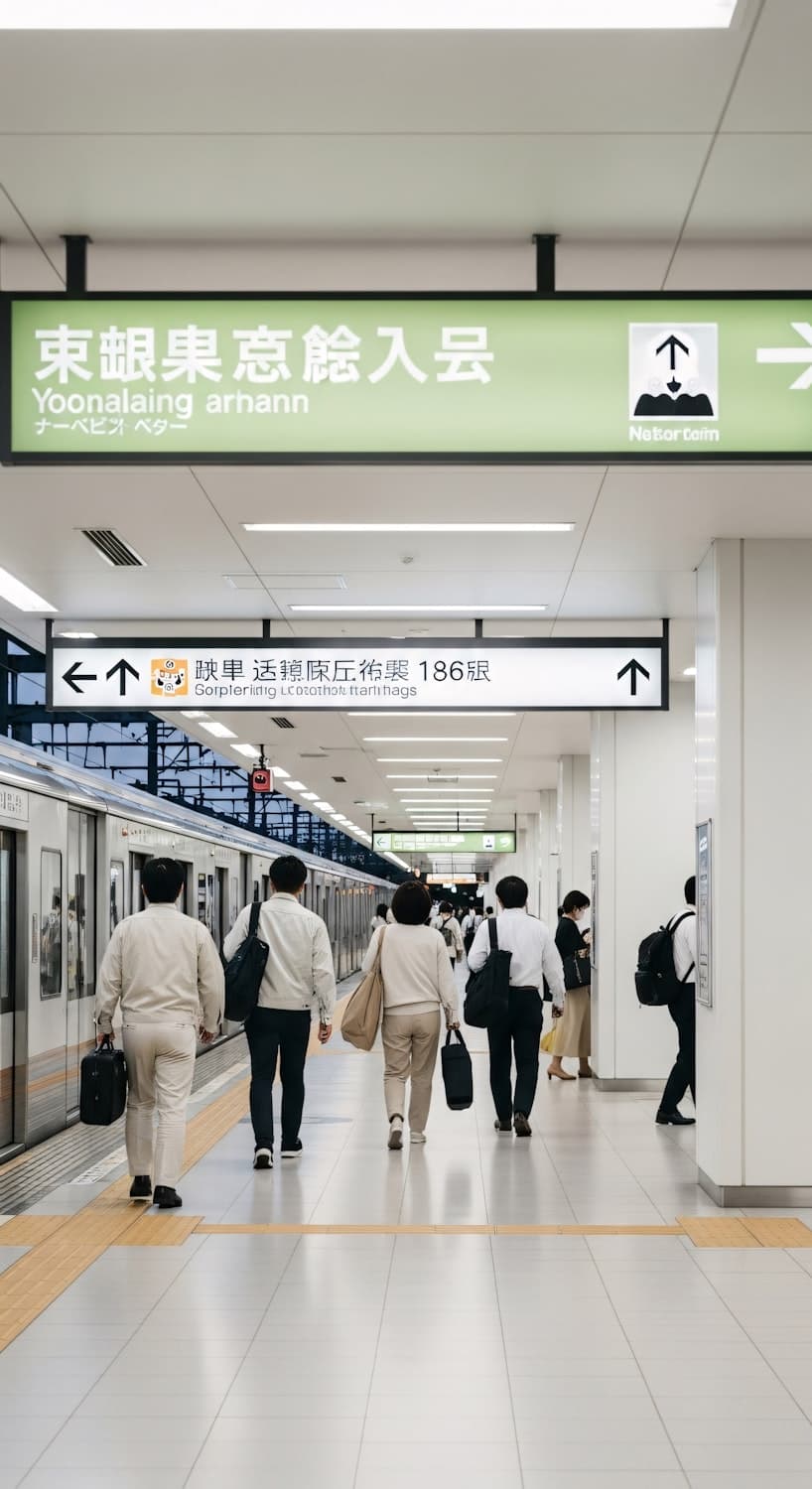
We extended the type scale and arrow language to platform signage so the phone and the station agree with each other. Matching the colour coding to the existing metro line palette meant the concept could be read by anyone who already uses the network, which is what the judges singled out.

(Key decisions)
- One instruction per screen, platform number as the largest element
- Countdown to departure rather than a departure time
- Full transfer sequence cached at journey start
- Stale data labelled with a timestamp, never hidden
- Sixteen point minimum type, validated at walking speed
(Outcomes)
- Best Interface, Bangalore Design Jam
- 1stBest Interface, Bangalore Design Jam
- Research to final prototype
- 48 hrsResearch to final prototype
- Target glance time, tested on platform
- 3 secTarget glance time, tested on platform
- Commuters tested in the station itself
- 9Commuters tested in the station itself
What I took from it
Constraints did the design work for us. Once we agreed the user was moving and offline, most of our nice ideas disqualified themselves.
(Next project)
Petal and Press
A stationery studio that needed to feel handmade and sell reliably