Petal and Press
A stationery studio that needed to feel handmade and sell reliably
Freelance identity and storefront for a two-person letterpress studio, built to survive being run from a phone between print runs.
- Role
- Identity, web design, art direction
- Timeline
- 6 weeks
- Platform
- Responsive storefront
- Year
- 2024
(The brief)
My first paid client. A letterpress studio in Kochi selling through Instagram DMs and drowning in the admin of it.
(The problem)
Their work is tactile, small-batch and genuinely beautiful in person, and every photograph of it looked like everyone else's stationery. They also had no capacity for a system that needed maintaining. Whatever I made had to be operable by two people who print in the morning and answer messages at night, with no designer on call.

Finding the voice in the process
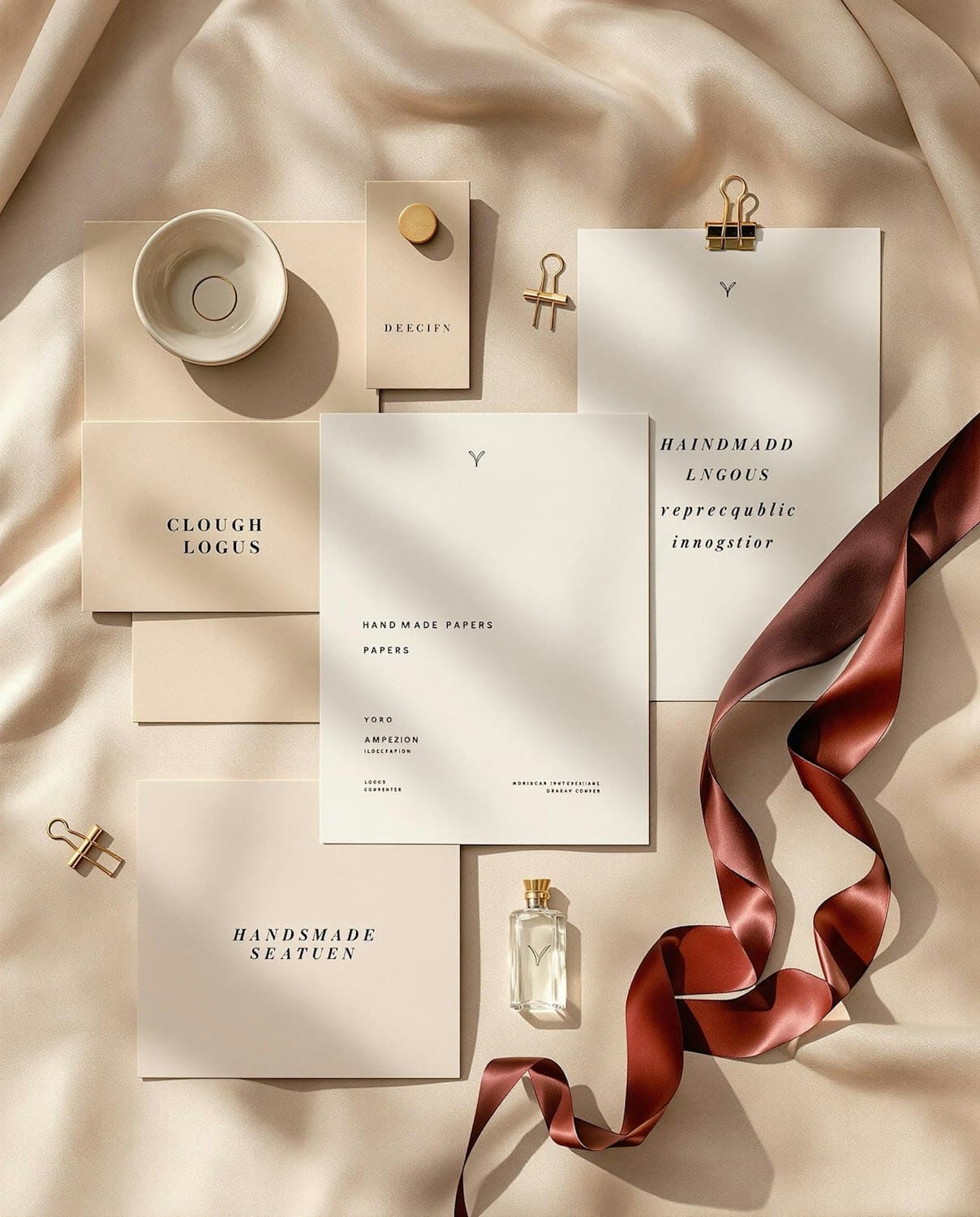
The interesting thing about the studio was not the finished cards, it was the press. I built the identity around the impression itself: a wordmark with a deliberate over-inked edge, generous margins that mimic the deboss, and a paper-white background used as a material rather than a default. The palette came from their own ink drawer so it stays reproducible on press.
A storefront that respects the product
Product pages lead with a large image at a fixed ratio, close-up detail second, and the price and quantity fixed within reach on mobile so buying never requires a scroll back up. Descriptions sit in a narrow measure with real specifics, paper weight, ink, edition size, because those details are the reason someone pays four times supermarket prices.
Photography they can repeat
I wrote a one-page shot guide instead of shooting everything myself: one window, one time of day, three surfaces, four framings. It is the deliverable they use the most. Nine months on, the new product photos still match the launch set, which is the only real test of an art direction handed to a client.
Built to be handed over
Every component was drawn with the longest realistic content, not the prettiest. Long product names wrap without breaking the grid, sold-out states are drawn, and the announcement bar can be emptied without leaving a gap. The handover was a forty-minute call and a two-page document, and they have not needed me since.
(Key decisions)
- Identity derived from the printing process, not the finished product
- Palette limited to inks the studio already stocks
- Purchase controls fixed within thumb reach on mobile
- A repeatable one-page photography guide as a core deliverable
- Components drawn against worst-case content, not ideal content
(Outcomes)
- Brief to live storefront
- 6 wksBrief to live storefront
- Running unchanged since handover
- 9 mthsRunning unchanged since handover
- Photography guide, still in use
- 1 pagePhotography guide, still in use
- People maintaining it, no designer needed
- 2People maintaining it, no designer needed
What I took from it
A design is only as good as the client's ability to keep it alive. The shot guide taught me more about handover than any component library has.
(Next project)
Loom
The design system I spent six months learning to be careful in