Kirana
Bringing the corner shop online without losing what makes it work
A neighbourhood grocery ordering flow built for people who shop by habit, in a mix of two languages, on a three-year-old phone.
- Role
- UX research, IA, interface design
- Timeline
- 9 weeks
- Platform
- Progressive web app
- Year
- 2025
(The brief)
A self-directed case study after watching my building's grocer take orders on three WhatsApp threads at once while his delivery notebook fell apart.
(The problem)
The existing apps in this space are built for a supermarket mental model: browse aisles, search, add to cart. Regular kirana customers do not browse. They order the same eleven items every fortnight, they call things by household names rather than brand names, and half the time they place the order in a mix of English and Kannada. Search-first navigation punished all three habits.
Watching the counter
I spent three mornings behind the counters of three shops in south Bengaluru, logging every order that came in. Sixty-one orders. Thirty-eight arrived as voice notes or phone calls, nineteen as text lists, four in person. Almost none of them named a brand. People asked for atta, not a specific five kilogram pack, and trusted the shopkeeper to pick. Any interface that forced a brand decision was adding work the relationship had already removed.
Reordering as the primary action
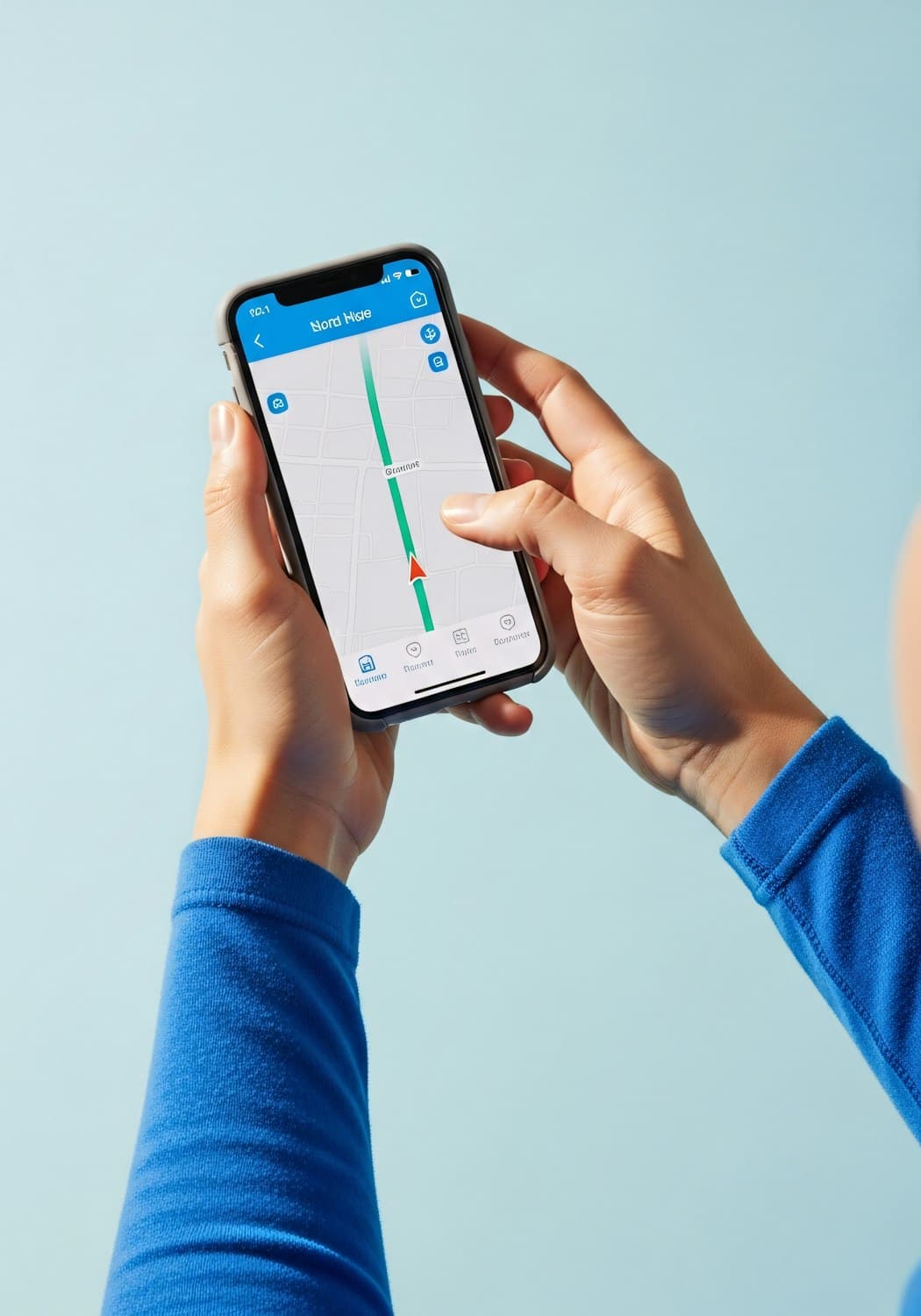
The home screen became a reorder screen. Your last order sits at the top as a single card with a repeat button, then your frequently bought items as a grid you can tap up and down in quantity without opening a product page. Full browse still exists, one tap away, but it is the second citizen. In testing, twelve of fifteen participants completed a repeat order without ever using search.
Language, without a language setting
A settings toggle assumes people commit to one language, and my participants did not. Instead every product carries both the English and the Kannada name in the same card, weighted so neither one reads as the translation of the other. I also indexed common transliterated spellings, because someone typing kothmir should not get an empty state.
Designing for the phone people own
I tested on participants' own devices, which were mostly budget Android handsets three or four years old. That killed two ideas immediately: a photo-heavy grid that took nine seconds to paint, and a bottom sheet that lagged badly on scroll. The final direction uses text-led cards, images at a smaller fixed ratio, and a substitution flow that works entirely offline until you hit send.

(Key decisions)
- Reorder first, browse second, search third
- Bilingual product names shown together, no language setting
- Quantity stepping inline, no product page detour
- Substitution preferences captured once, applied to every order
- Text-led cards to keep first paint under two seconds on budget hardware
(Outcomes)
- Real orders logged behind the counter
- 61Real orders logged behind the counter
- Repeat orders completed without search
- 12/15Repeat orders completed without search
- From open to a placed repeat order
- 3 tapsFrom open to a placed repeat order
- First paint on a four-year-old handset
- 2.1 secFirst paint on a four-year-old handset
What I took from it
Designing for a habit is different from designing for a task. Once I stopped treating the shop like a small supermarket, the interface got shorter every week.
(Next project)
Tempo
Royalty analytics that independent musicians can read in a minute